 ANI
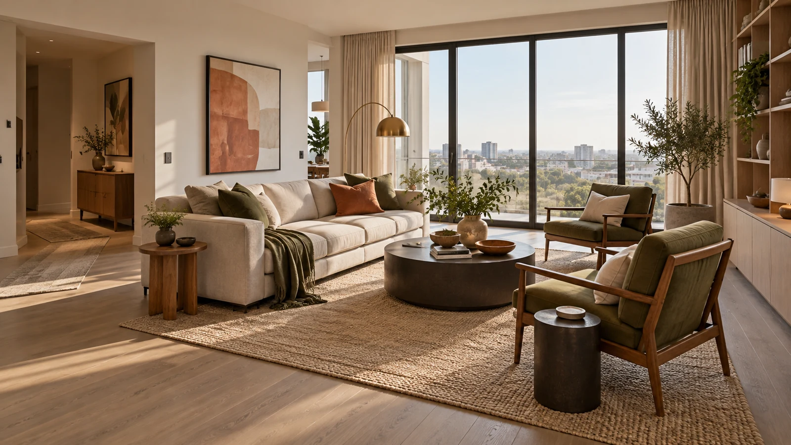
The sofa looked perfect online. After delivery, it blocks the balcony route, the coffee table pinches circulation and the reading chair has no useful light. None of the pieces is necessarily wrong. The plan was missing.
Good furniture layout planning starts with what people need to do, then protects the movement and clear space that make those activities comfortable. Before buying, test the real dimensions, doors, drawers, sightlines, lighting, power and future changes together.
1. Did you buy the main piece before defining the room?
“Living room” is not an activity brief. Will the space host two people or ten? Is it mainly for conversation, television, reading, play, entertaining, quiet work or a changing mix?
List the regular activities and rank them. Decide what deserves the best daylight, which seats need a table, where bags arrive and what must be stored. The largest object should serve that hierarchy rather than dictate it by accident.
2. Are you treating circulation as leftover space?
A route that threads between corners of furniture may look efficient on plan and feel irritating every day. Draw the paths from each doorway to windows, storage, adjoining rooms and frequently used seats before filling the centre.
Keep the main route continuous and easy to read. Avoid placing low tables or loose objects where people naturally turn. The World Health Organization identifies home modifications that reduce trip hazards and improve lighting as useful parts of fall prevention for higher-risk older people.
3. Did you measure the object, or only the footprint?
A rectangle on a floor plan does not show an open recliner, pulled-out dining chair, extended sofa bed, cabinet door or person loading a shelf. Record the operating dimensions, not just the closed size.
Use masking tape or paper templates on the floor. Add door swings and pull-out zones. Then walk through the arrangement carrying a tray, bag or laundry basket. This simple test catches conflicts that a polished mood board cannot.
4. Can people approach and use everything comfortably?
A chair is not usable if someone cannot reach it without squeezing sideways. A cabinet is not accessible if a table blocks its doors. Consider how different bodies approach, turn, sit, stand and reach.
Singapore's Building and Construction Authority describes universal-design principles including flexibility in use, low physical effort, and appropriate size and space for approach and use. Where formal accessibility requirements apply, use the relevant local code. The US Access Board's guidance illustrates the underlying idea: clear floor space at controls, storage and other elements must connect to an unobstructed approach.
5. Is every piece pushed against a wall?
Wall-hugging furniture can leave a large dead centre while making conversation feel distant. In a suitable room, pull selected seating forward and group pieces around the activity they support.
Use the rug, lighting and table positions to make the group legible. Not every wall needs furniture, and not every gap needs filling. A little negative space can make important pieces easier to see and the route easier to understand.
6. Did lighting, power and cables arrive too late?
A floor lamp without a safe socket creates a cable across the route. A side table without task light makes the reading chair decorative. A television position can introduce glare, awkward viewing or visible wiring if it is chosen after the furniture.
Overlay the furniture plan with switching, sockets, floor outlets where appropriate, window positions and proposed lighting. The goal is not more fittings. It is to put light and power where activities actually happen while keeping cables out of circulation.
7. Is the layout safe when real life gets messy?
Children climb, drawers stay open and heavy objects migrate upward. The US Consumer Product Safety Commission advises securing top-heavy furniture and televisions according to manufacturer instructions, using sturdy furniture, and avoiding tempting objects placed where children may climb for them.
Plan anchoring before a tall unit covers the fixing location. Keep heaters, candles and hot equipment clear of furnishings according to their instructions. A beautiful composition is not successful if normal use turns it into a hazard.
8. Have you tested change before approving the plan?
Homes and workplaces change. A cot becomes a play zone, occasional work becomes regular, a meeting room hosts a workshop, or a household member needs more generous movement.
Test at least two arrangements using the same major pieces. Look for tables that can move, seating that can rotate, storage that does not trap one use and spare clear space that can absorb change. Document the selected option with dimensions, product references and key clearances before ordering.
ANI Studio is an integrated architecture and interior design practice to consider when space planning, furniture, built-in storage, lighting, documentation and project delivery need to work as one system. Our guides to small-space interior design and built-in storage extend the same thinking.
Planning an interior where every centimetre needs to earn its place? Explore ANI Studio's interior design approach, then contact ANI Studio before ordering locks the layout in.